INTO THE WOODS
INTO THE WOODS - AT HOME WITH A DESIGN ASCETIC
by Lauren Murrow photography by Joe Fletcher (originally published in San Francisco Magazine October 2013)
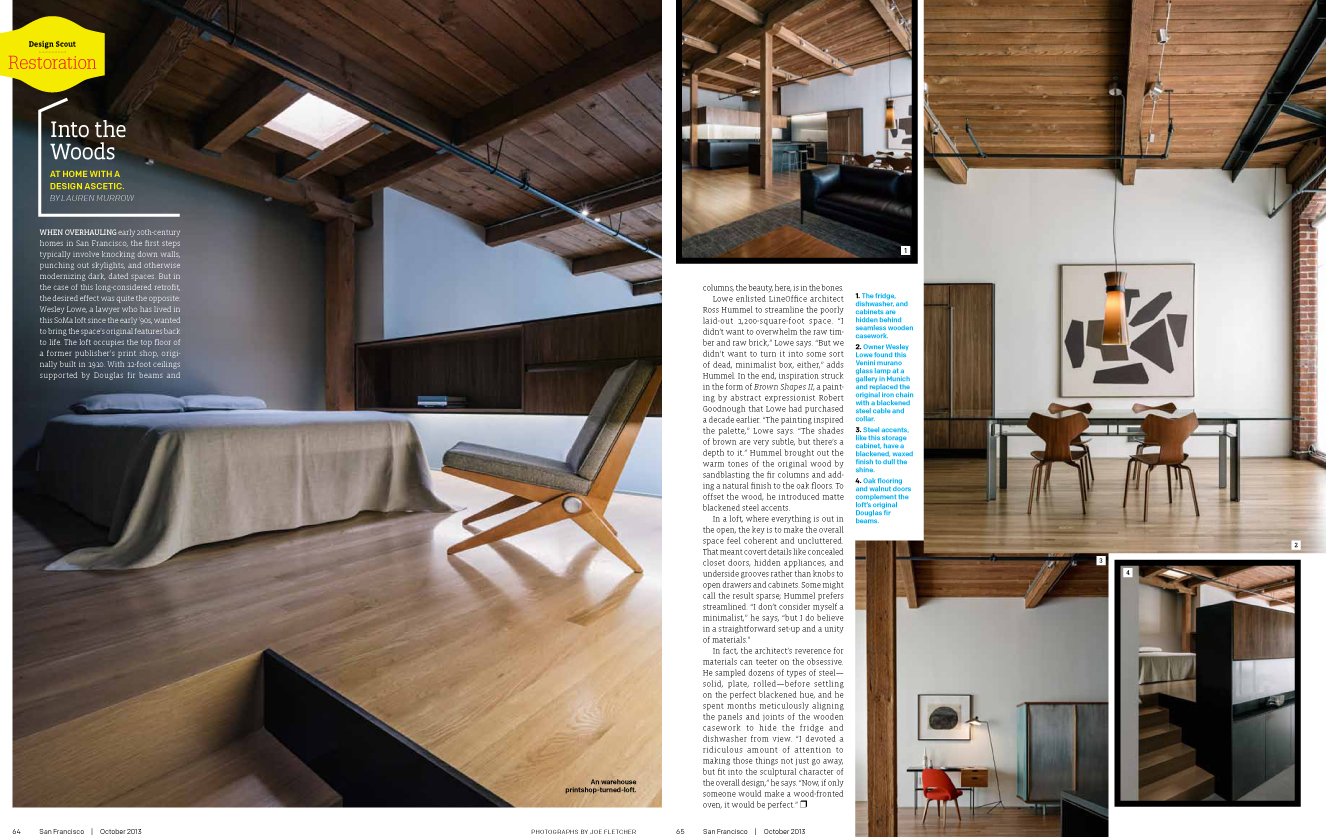
When overhauling early 20th-century homes in San Francisco, the first steps typically involve knocking down walls, punching out skylights, and otherwise modernizing dark, dated spaces. But in the case of this long considered retrofit, the desired effect was quite the opposite: Wesley Lowe, a lawyer who has lived in this SoMa loft since the early ’90s, wanted to bring the space’s original features back to life. The loft occupies the top floor of a former publisher’s print shop, originally built in 1910. With 12-foot ceilings supported by Douglas fir beams and columns, the beauty, here, is in the bones.
Lowe enlisted LINEOFFICE architect Ross Hummel to streamline the poorly laid-out 1,200-square-foot space. “I didn’t want to overwhelm the raw timber and raw brick,” Lowe says. “But we didn’t want to turn it into some sort of dead, minimalist box, either,” adds Hummel. In the end, inspiration struck in the form of Brown Shapes II, a painting by abstract expressionist Robert Goodnough that Lowe had purchased a decade earlier. “The painting inspired the palette,” Lowe says. “The shades of brown are very subtle, but there’s a depth to it.” Hummel brought out the warm tones of the original wood by sandblasting the fir columns and adding a natural finish to the oak oors. To offset the wood, he introduced matte blackened steel accents.
In a loft, where everything is out in the open, the key is to make the overall space feel coherent and uncluttered. That meant covert details like concealed closet doors, hidden appliances, and underside grooves rather than knobs to open drawers and cabinets. Some might call the result sparse; Hummel prefers streamlined. “I don’t consider myself a minimalist,” he says, “but I do believe in a straightforward set-up and a unity of materials.”
In fact, the architect’s reverence for materials can teeter on the obsessive. He sampled dozens of types of steel - solid, plate, rolled - before settling on the perfect blackened hue, and he spent months meticulously aligning the panels and joints of the wooden casework to hide the fridge and dishwasher from view. “I devoted a ridiculous amount of attention to making those things not just go away, but fit into the sculptural character of the overall design,” he says. “Now, if only someone would make a wood-fronted oven, it would be perfect.”
